The Project
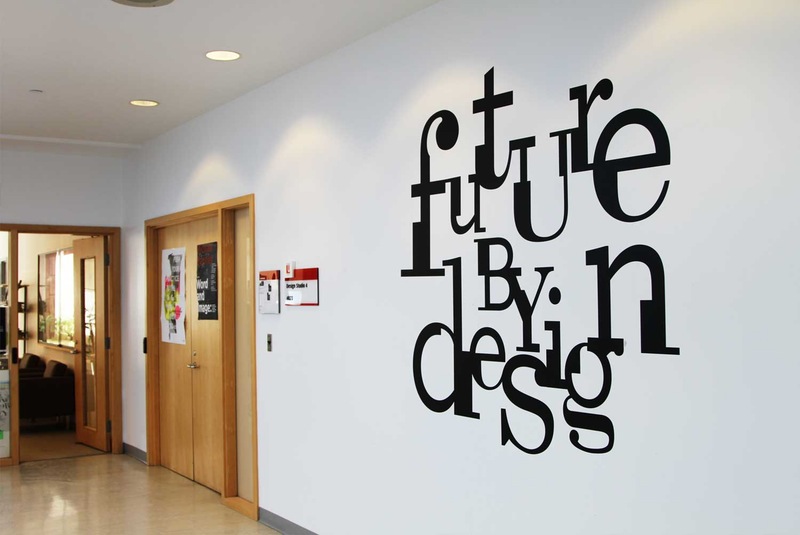
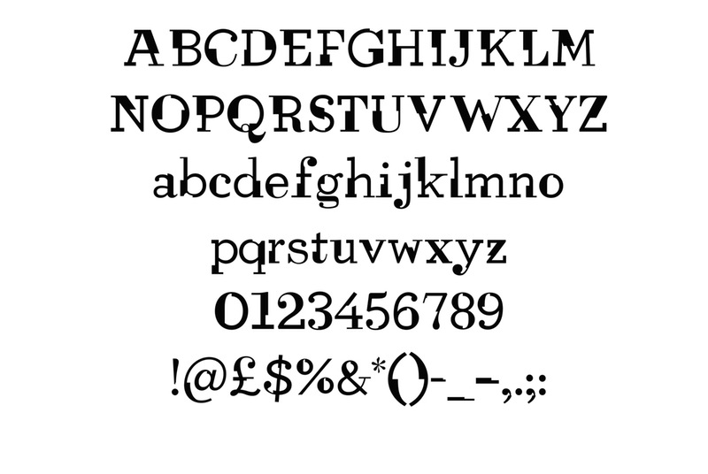
CutType is a typeface I designed to have constructed, architectural elements for use in promotional materials for the Royal Architectural Institute of Canada (RAIC). It was also later employed in the branding and exhibition design for an exhibition in the York University Department of Design, called ‘Future by Design’.
Founded in 1907, RAIC is a professional membership organisation and “the leading voice of architecture in Canada”. As an academic exercise, I proposed that they would initiate a series of exhibitions hosted by the Canadian Centre for Architecture (CCA) in Montreal, and that CutType would be used in the communication of these events.
About the Typeface
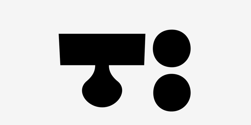
The intent for the typeface was that it be a display face which appropriately conveyed architecture through industrial, angular, constructed elements. It was to be used to give a sense of playful, constructed spaces and may be used in an abstract sense, letters layering over one another – building forms – rather than for body copy or important details.
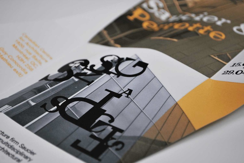
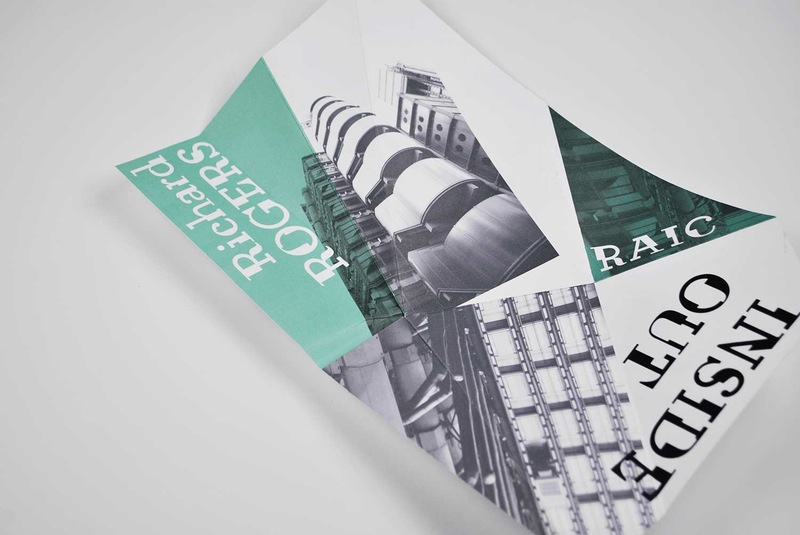
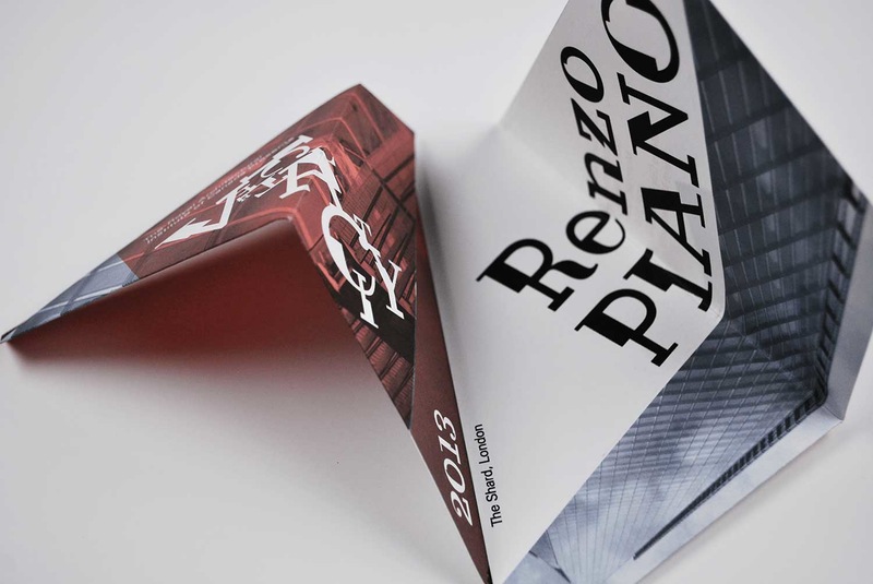
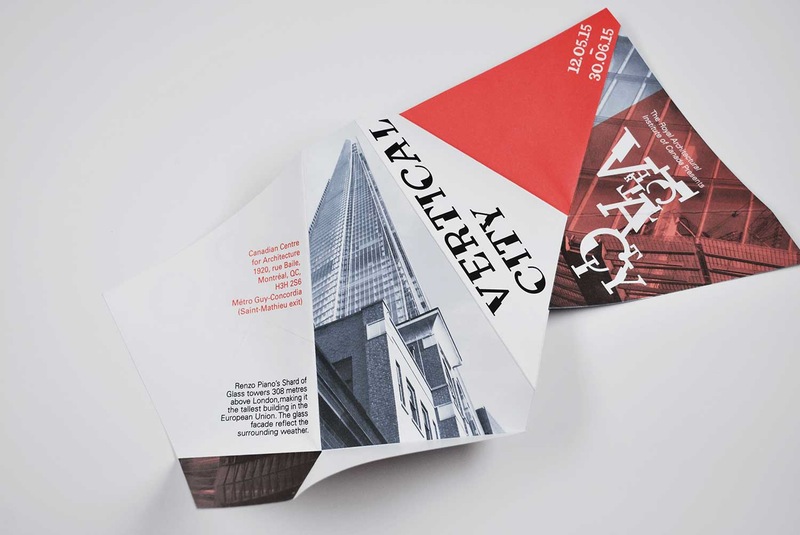
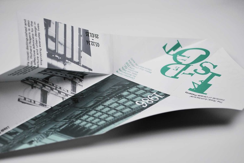
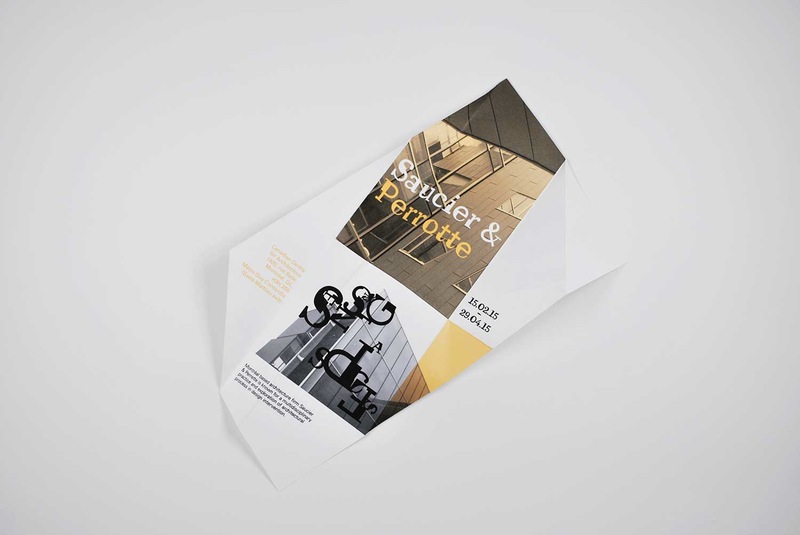
The three events I proposed were retrospective exhibitions on the work of Richard Rogers, Renzo Piano and Canadian firm Saucier & Perrotte. Using my own photography of buildings these architects have designed, I then created exhibition announcements to be sent out to members of both RAIC and the CCA. As RAIC does not usually present exhibitions at the CCA, CutType was used to characterize these exhibitions, linking them as a series and distinguishing them from regular events, through its dynamic, instantly recognizable style. By choosing to take this approach, and design a custom typeface, recipients of the announcements would likely be intrigued, and investigate further into attending.
CutType came out of the physical construction of paper and ink, fragments of letter forms
It was challenging to build these fragmented forms and maintain the intended constructed, disjointed style, whilst working to maintain the balance and legibility of each letter. The individual letters must be able to exist both in their own right, and work with the others as a unified voice, capturing the essence of architecture.
Exhibition Announcements
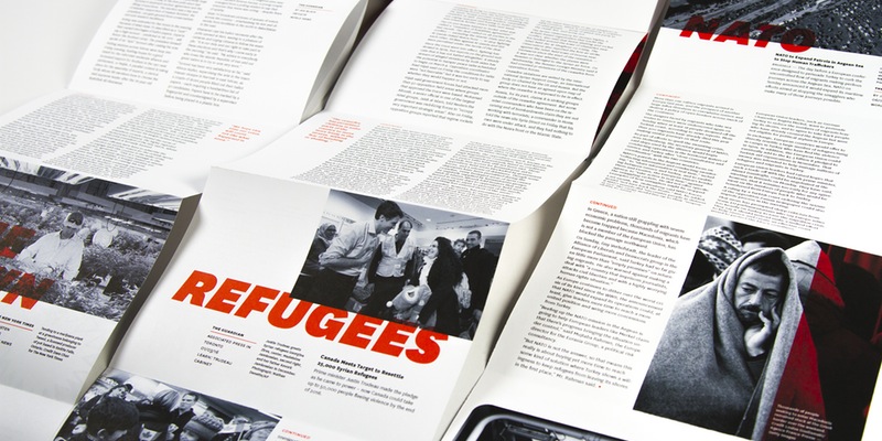
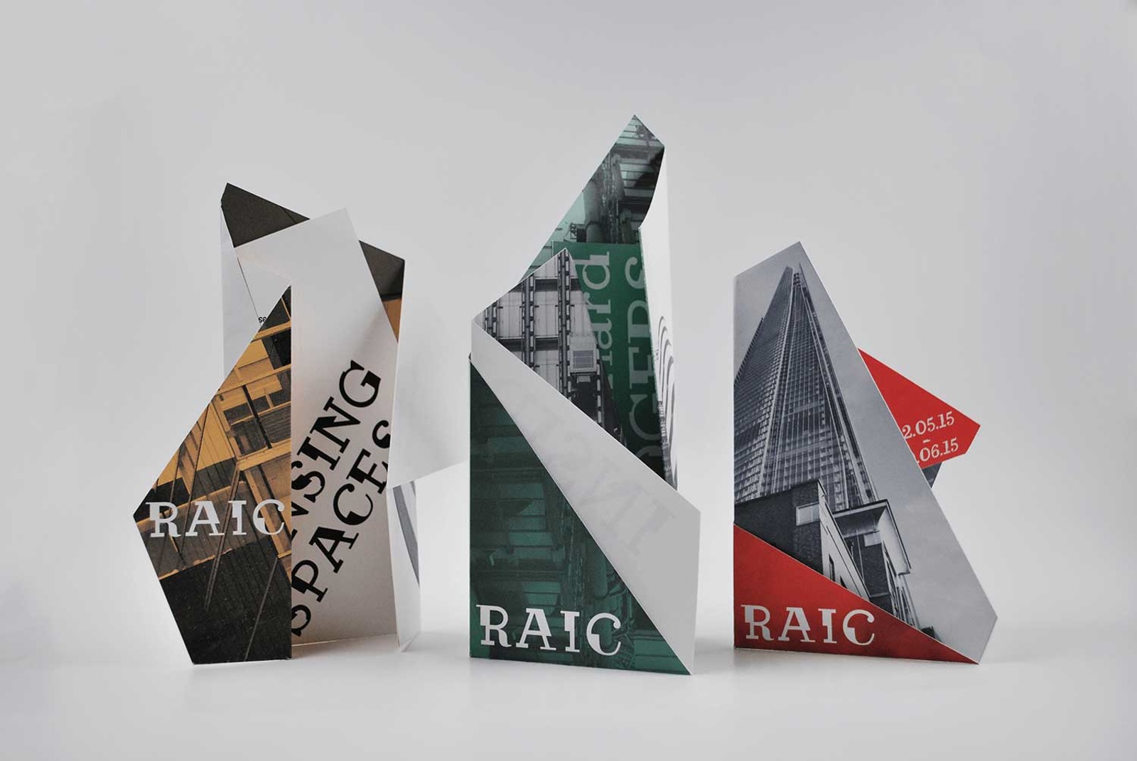
Once CutType was finished, I started designing the exhibition announcements, keen to continue the previous approach and effectively showcase the typeface. I experimented with paper folding, deciding that the announcements should be folded to be free standing, like buildings. They can also be unfolded to small, flat posters, and whether folded or flat, they present something to keep in view as a save the date, as the events approach.
Each folded piece has many sides, each facet holding a sliver of an image or piece of information about the exhibitions. The designs are bold, capture the attention of the recipient and are designed to stand out from regular newsletters or announcements – this is a special exhibition series. The folded designs also force the recipient to interact with the piece, unfolding and turning to collect scattered pieces of information, in the same way one might have to walk around a building to learn more of its structure. The announcements are successful in creating a very specific visual language for the events – the typography, colour scheme, style of fold and black and white fragmented imagery.
Process
I learnt a lot about the details of typography and the challenge of hundreds of small elements (26 letters, upper and lowercase, plus numbers, symbols and punctuation) needing to work together as one unified system. Designing a full typeface is also seemingly unending, there always being something to slightly adjust or another symbol to add. In this sense, I feel that typefaces must always be works in progress, else take many more years to finish that I had to make CutType. I enjoyed playing with the paper folds, and because so much of the content followed fold lines precisely, this presented many print and production challenges.
Exhibition Design
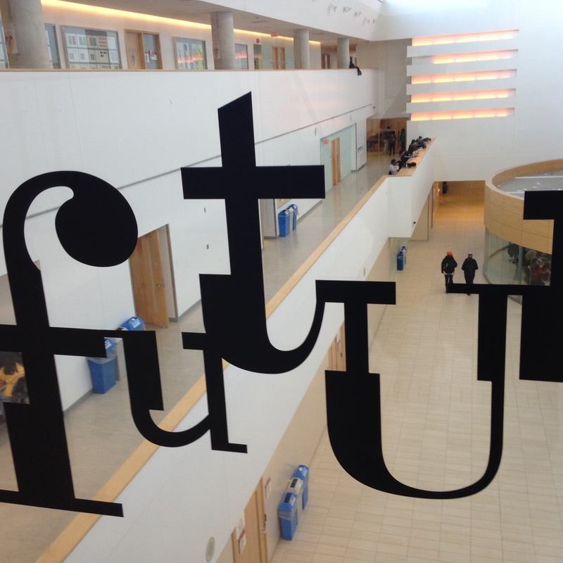
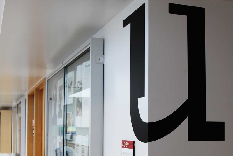
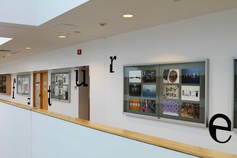
As mentioned, CutType was also used in the design of an exhibition at the university. I designed the logo and used it both in advertising posters and in six feet high vinyl lettering applied to the walls of the space. Letters were also scattered on the building throughout the exhibition space, interacting with the architecture and drawing people through the building. It was exciting to see the letter forms not only so large, but in the context of architecture, which they were designed to reflect. There were interesting moments where letters wrapped around corners or light shone through the glass they were applied to, casting letter shaped shadows. It was an appropriate and dynamic pairing, not only having the letters interact so directly with the architecture but in an exhibition of student work – constructed and built upon previous works.