Since nature can’t educate humans on the effects of plastic pollution by itself, I took the initiative to create a pamphlet and a digital publishing that explores information design as a vehicle for positive action and education.
Problem
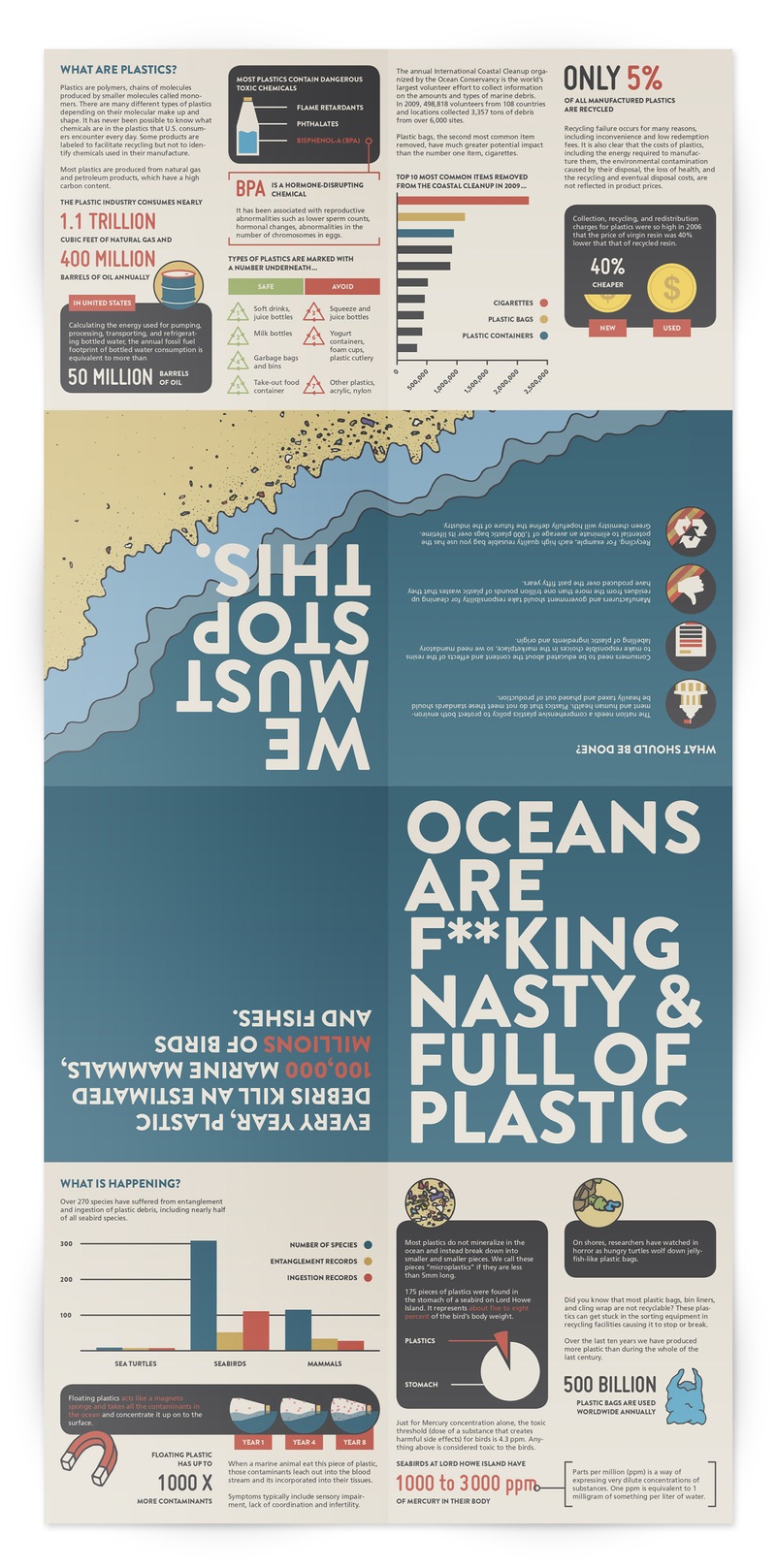
Plastics persist in the environment for hundreds of years, affecting waterways, marines, and terrestrial wildlife. Though human beings are at the top of the food chain, they are greatly affected by pollution — perhaps without even realizing it. Every year, plastic debris kills an estimated 100,000 marine mammals, and millions of birds and fishes. There is a dire urgency to educate people on this issue, and improve recycling and waste management.
Shaping the Experience
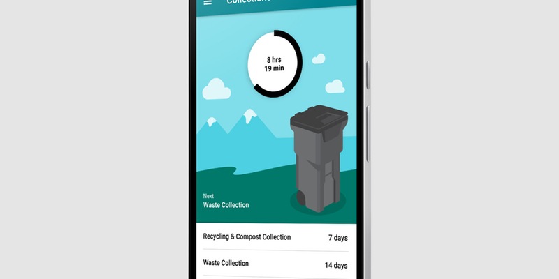
Before elaborating on the structure of the pamphlet, I took into account that I would later have to convey the same information on an interactive piece. It was crucial for me to come up with a concept that was responsive and adaptive to any mediums. I did not want to run into any obstacles when designing its interactive counterpart.
The project is organized into five sections. They are arranged in a logical order to facilitate reading. They include:
- A cover page that makes a bold statement to pique the interest of readers
- An opening sentence that describes the core of the problem
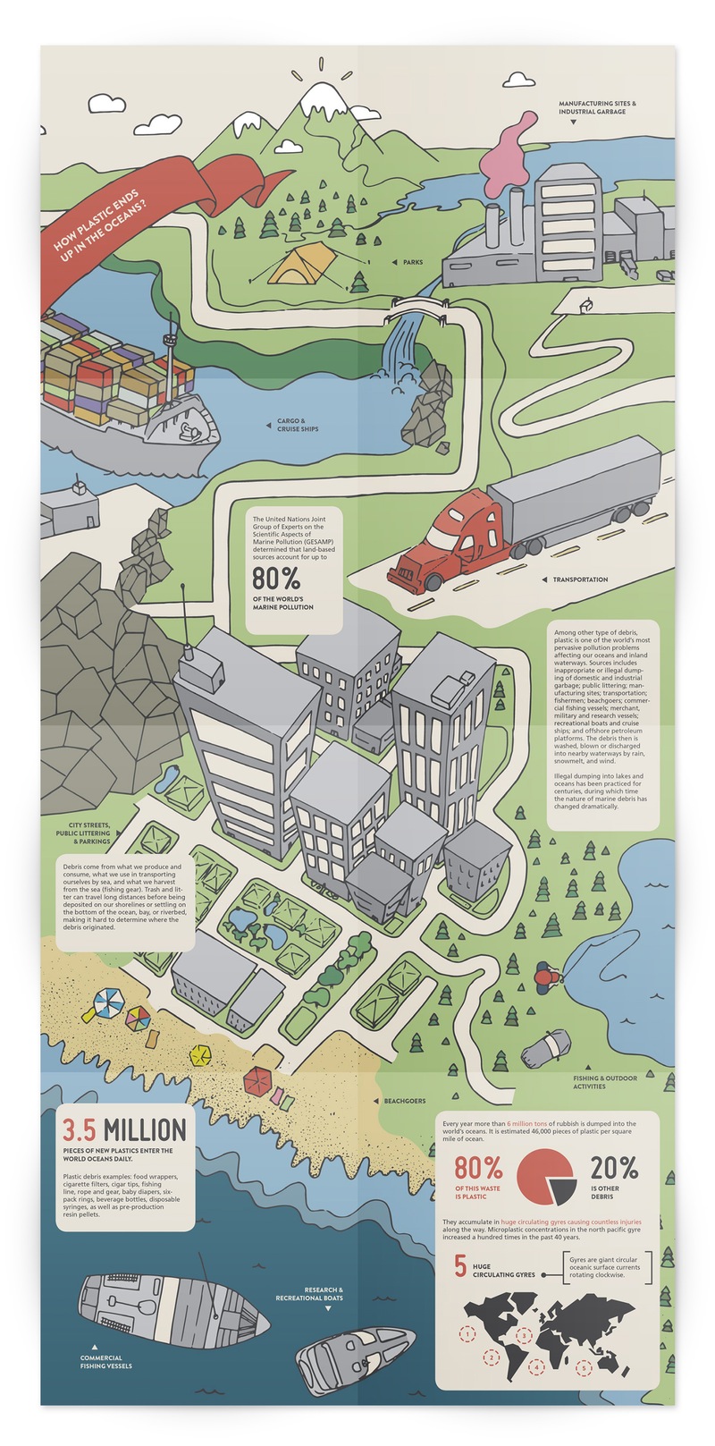
- A case study with infographics and statistics that explain the problem of plastic pollution
- A poster (the pamphlet transforms into a poster when opened completely)
- Finally, the good ol’ call to action
With the digital publishing folio, possibilities of interactions are obviously greater than print. I integrated videos (i.e. MIDWAY, a short film by Chris Jordan), animated infographics, show/hide information, and links to external websites if readers want to learn more. Fortunately, I did not need to integrate an extensive starter guide at the beginning. I clearly differentiated the navigation and touchpoint from the rest of the design so users could learn as they use the product.
Branding the Experience
The unique illustrations attract viewers and keep them entertained as they read. In my experience, people are more likely to use reading materials if the products use pictures or illustrations since it makes the experience more enjoyable.
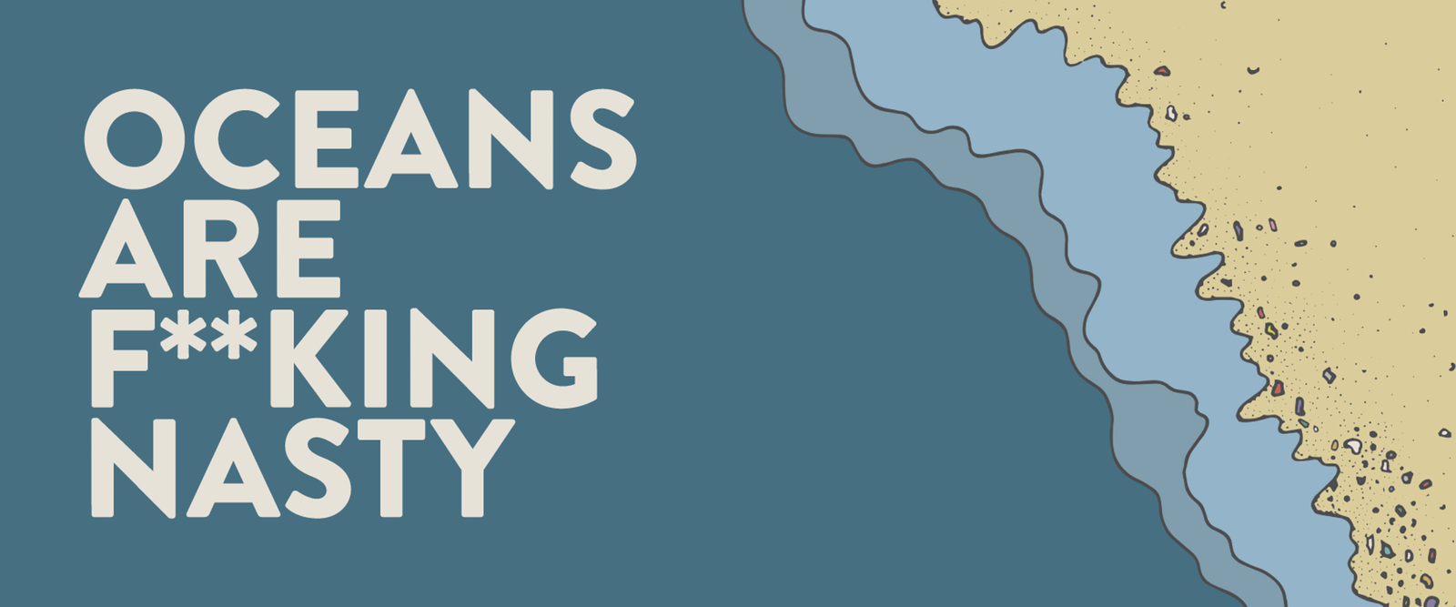
When the pamphlet is fully opened as a poster, the illustration is both an infographic and a placeholder for text. Typesetting the text in small bits of information helps alleviate the load of information to read. Overall, I styled the project with a bold yet desaturated colour palette, and used strong language to make the message clear. Oceans are f**king nasty because of the amount of plastic they carry. And we are all to blame.
Conclusion
The project is successfully addressing the issue of plastic pollution in a creative, unique way, and reaches both online and offline audiences. It should be an interesting tool to empower non-profit organizations such as the Environmental Defence, or the Canadian Wildlife Federation, to educate the general public on the topic.